Layout Principles in Graphic Design
A Page Layout are the rules you need to follow when you want to achieve an effective page layout and they apply from the letterhead to posters and magazines. Having a layout is basically organizing all the things on the page, the words, the pictures, and text to show strong visual impact. There are some notes you need to take down for making an effective page layout.
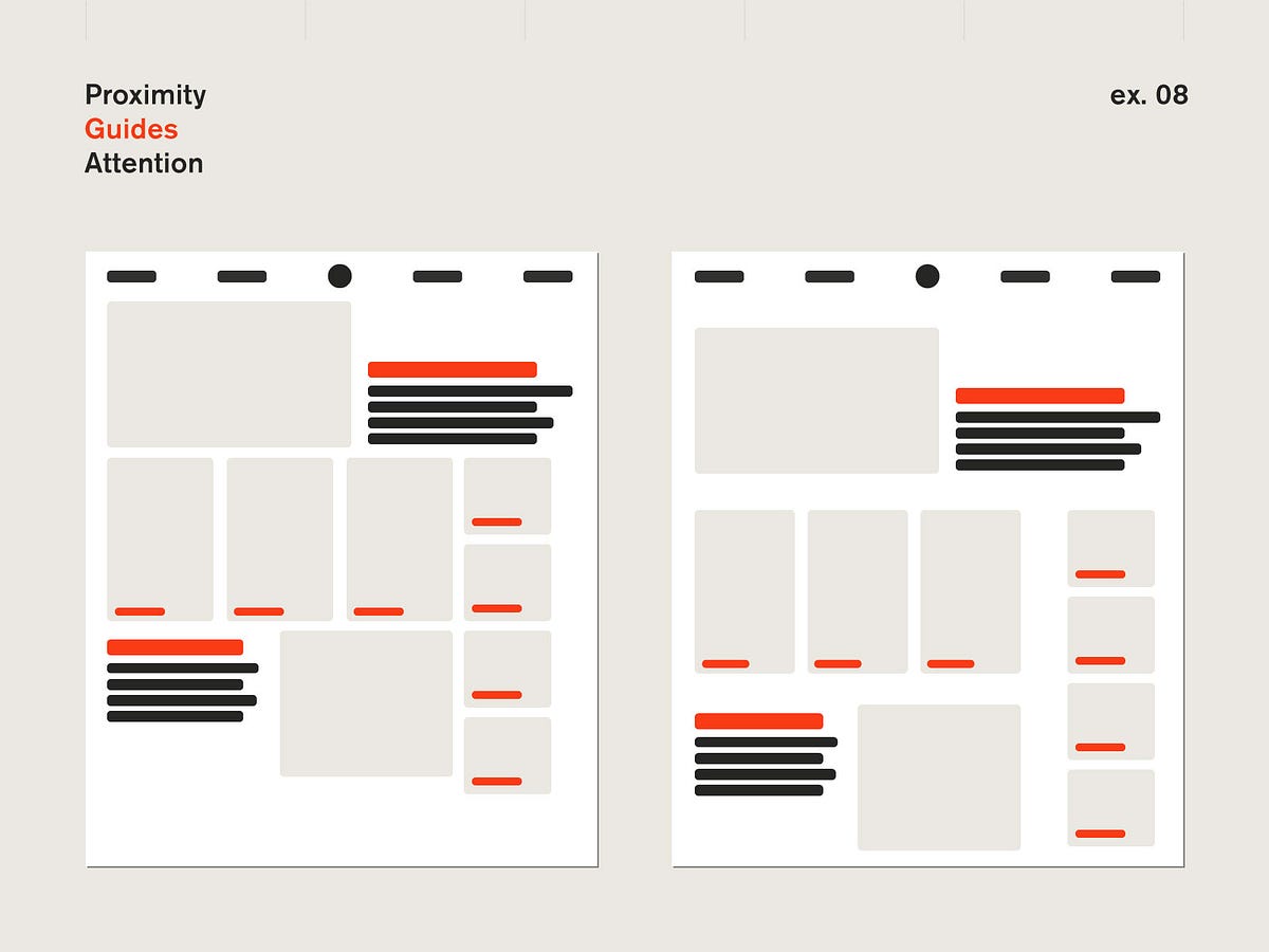
Proximity
Proximity is when you join all the related things in to groups, such as text and images. This can help with the viewer knowing where to look as it doesn't confuse them and change directions every few seconds to get the information they need.
Alignment
Alignment is an important concept as it helps with showing your viewer where to look and it makes it look clean and professional. It makes sure that its formal, the elements are visually aligned and that your layout doesn't look odd.
Repititon
Repitition creates a structure in which you can travel by without feeling confused. A bullet list is a great example of this. With a bullet list, you know that the next point is where its needed to be and shows a smooth pattern your eye can follow.
Contrast
Contrast is when you want to build visual interest for your viewers. This works for an area in which you want your viewers to pay great attention and visual excitement and this works by adding elements that are opposite such as warm and cool colours or large and small types.
My Experience -
This helped me with thinking of how I should organize my layout the next time I'm assigned this kind of assignment. I would usually shift around the context and see which looks best rather than dividing them into groups of context that are similiar to each other.


Without these layouts I think our info would be all over, lol. Short but sweet post. Very well done!
ReplyDeleteUsed properly, these elements and principles of layout design will surely help to make an effective magazine/poster! Well done on your post!
ReplyDelete